 I decided to write this article when a small dispute started over a humorous tech support note I shared on Google+ in which a customer asked how it could be that when she added a shortcut to a movie to her USB-stick the movie would only play on her computer, but not on anyone else’s.
Kategorie: Usability
Ensuring Good Passwords: Reward or Restrict?
We’re currently in the designing phase of a password rule configuration form. At first this sounded easy, but after a couple of discussions it turned out that the whole password strength and rule configuration topic is a pretty delicate one once you start digging deeper and questioning what you originally have thought was unquestionable.
The basic question here is „What does a good password make?“ where good actually means strong. The other question is „How can we get users to choose good (i.e. strong) passwords?“ – and that’s where the trouble starts.
The problem is that there’s a lot of tension when it comes to getting users to choose good passwords. There’s tension that you might never resolve and just have to find a compromise and there’s tension as a result of a false sense of security and policies established around that sense.
An example for the first type of tension is one of the basic problems of good passwords: The stronger a password, the harder it is to remember. It would be great if everyone chose a 24-character totally random password and had a different password for each service and application they use, but that’s just not going to happen. So, we need to compromise on the strength of a password in order for people to be able to remember it.
Of course there are tools that help organize our passwords, but let’s stay real here – this is not something that for example my parents would use. If I were to install KeePass on my parents‘ computer and tell them to use 20-character randomly generated passwords from now on, my mother would stare at me blankly and tell me that she was doing just fine with her passwords.
Now there are two ways to go from here: I’d call them restriction or reward.
Restriction means defining password rules that users have to comply to. Minimum length, use of numbers, symbols and uppercase characters, and so on. I can also force users to change their passwords every two months and prevent them from using any of their old passwords.
Reward means rewarding users for choosing a good password. It’s a bit of an ‚attaboy‘-reward, but still. Whenever I sign up for a new service or change my password, I like to see the password validation bar go from red and weak to green and strong, telling me that, yes indeed, the password I chose is strong enough to protect my account sufficiently.
The problem with restriction is that it doesn’t guarantee good passwords. If you take the most common password rules, minimum length as well as required use of numbers, symbols and uppercase letters, you can still choose Admin,1 as your password and be good to go. Requiring users to change their password after a defined period doesn’t help either. The user who chose Admin,1 initially will just change the password to Admin,2 to satisfy the required password change.
A strong password doesn’t need symbols or numbers. It simply needs to be hard to guess. A good password is a random set of characters and that’s something that’s hard to put into configurable rules.
Restriction and reward don’t really contradict each other, but they’re different approaches of how to educate users to choose good passwords. There’s a difference between forcing users to adhere to a set of rules and rewarding them for making sensible choices. And there’s tension everywhere: How far can I go with configuring rules to enforce good passwords without seriously annoying users because none of their passwords are accepted? Huh?
As I said, there are a lot of questions here and I’m not done thinking about it.
Theresa Neil on Designing Rich Applications
I considered just quickly posting this on my Tumblr blog, but I think this fits in here very nicely and probably better. Have a look at the Theresa Neil’s slideshow on designing rich applications. I especially like that the slides are pretty self-explanatory, so that you don’t feel you’re missing too much without someone commenting on what they actually mean.
The slideshow was published as a part of a blog entry. I also like the idea of having a flip book to browse for UI design ideas. In fact it makes my fingers a bit itchy and I’d like to just start one of my own if I only knew how to find enough time to make one.
Inline Validation, Good and Not So Good
I keep on stumbling about the whole inline validation design pattern these last days. It started with the sign-up form for boxee, then was followed by an article at A List Apart and today I was just fascinated by how one single company could get it so right and so wrong at the same time.
Let me start by saying this: I’m a huge fan of inline validation. I think it rocks. It does have its problems, but I dig the general concept and I’ll fight for inline validation over validating on save any time.
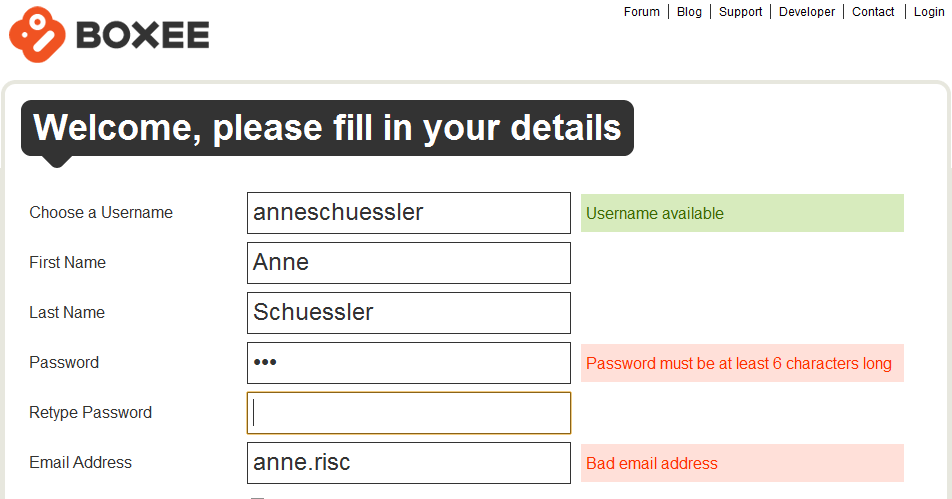
The boxee sign-up form is a great example for everything that’s good and pretty about inline validation:
Helpful error messages, good choice of fields that can benefit from inline validation and a nice and clean design. I know exactly what I did wrong and what I need to do to make it right. I also get positive feedback for fields that might have issues (i.e. the username which may or may not be already taken) that I need to be aware about.
Before I go too deep into the details of inline validation, I’d like to point everyone to the article „Inline Validation in Web Forms“ by Luke Wroblewski at A List Apart which sums up a usability test with various forms of (inline) validation. While the article states that inline validation is generally a lot better than validating all input at once after the user has clicked Save (or completed a similar action), there are also some drawbacks and considerations when applying this design pattern. Basically, inline validation is good, but you still need to figure out how to use it for what you want to achieve.
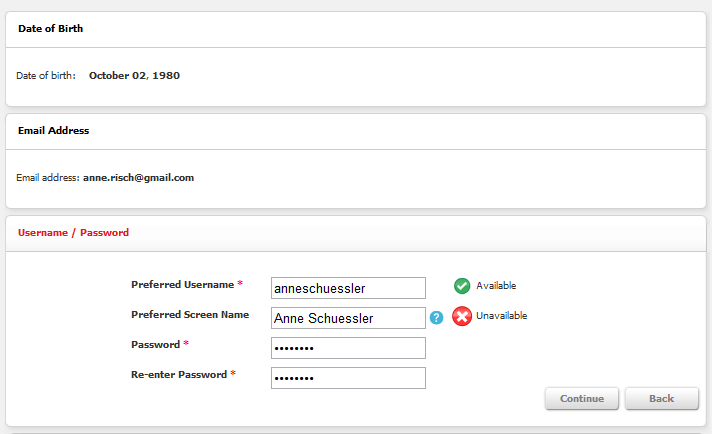
Today I wanted to sign up for Club Nintendo, just to have a look. The first attempt failed because I tried to sign up on the US page and didn’t notice until far along the signup process that I was on the wrong page. However, I got a glimpse at how inline field validation is used here:
Apart from using a progressive disclosure pattern (which seemed a bit over the top here, but wasn’t actually disruptive) inline validation was nicely used for checking whether my chosen username and/or preferred screen name was still available.
The password fields didn’t use any inline validation, which makes you wonder a bit. Password fields are a brilliant candidate for inline validation, but apparently this wasn’t considered here.
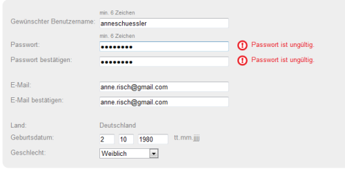
However, when I switched to the European site, I got to use the following signup form:

Never mind that it’s in German, I still think you get the point. I don’t care so much about how the US form used a step by step approach for filling out the form and this one just has everything on one form. Either way was fine by me.
However, although inline validation here was nicely used for the password fields, it was completely unhelpful. It told me that my password was invalid. But. It didn’t tell me why. Nowhere on the page could I find any information on how my password should look like to be accepted. This is definitely irritating and annoying. Applying inline validation and then refusing to give any reasons for wrong input seems like the UI design version of „It’s the thought that counts“. Unfortunately in this case, it’s not. If you want to do it right, do it right and don’t stop when your halfway there.
Inline validation is a great way to give immediate feedback on the user’s input and help them fill out a form correctly with the very first try. But it only works if you provide helpful and clear information as well.
PS: I finally figured out a password that worked. My guess is that Club Nintendo Europe doesn’t approve of any symbols in their users‘ passwords. Not sure who thought this would be a great idea. I don’t agree. And I also don’t know whether this actually was the reason.
iPod Icon Mystery – A Design Experiment
I was a bit puzzled when I first noticed the new icons that are displayed just below the time slider thingy for podcasts. It was actually when I was on my way to the supermarket, so I didn’t really date to find it out, because I already was trying not to run into things and listening to a podcast at the same time and didn’t want to add a third task to the list.
When I wrote my article about the new upgrade I started to muse aloud (if you can apply this to writing as well) about these icons and when I reached the third paragraph I thought I’d just leave it out completely and write in detail about it later. I think it makes a good example for usability and design. So here goes:
The first thing I’d like to say is that yes, I know it’s hard to find an icon that conveys exactly what the button does without any risks of misinterpretation. Still, I couldn’t really say what any of these icons wanted to tell me. I had vague ideas, yes, but I needed to actually try each of them out to see what they actually did – and confirm my suspicions.
Let’s start with the first one. What does the envelope do? Something with mail? Mail updates? Send a mail? Anything to do with RSS? Who knows. The second one could actually have to do something with reverse… like what? Go back 30 seconds? The 1x is as puzzling as the envelope. One time WHAT? Can I change that to two? Anything else? Oh wait, let’s try that.
[Imagine me pressing the 1x button here.]
Oh look, it changes to 2x. What happens if I press it again? 1/2x. Interesting. The answer of course (and I guessed it, too) is that this button changes the speed of the podcast. It also adjusts the pitch, so you don’t get the Mickey Mouse effect when listening to a podcast running at twice the speed.
I don’t know if I’ll use that feature. When I tried it on one of my favorite podcasts, I had trouble following the content. Basically, twice the speed was too fast. I think that 1,5x might be an interesting adjustment. A bit faster, but not actually to the point where you can’t follow what’s being said.
But enough of that, now comes the icon with the 30 and the arrow. That one seemed very obvious to me once I tested it and realized what it does. Want to guess? Exactly. It goes back 30 seconds. While this is nice, I would actually suggest being able to forward 30 seconds, too. When it comes to long podcasts, using the time slider can be tricky and I can currently think of more use cases for forwarding than for reversing. But maybe that’s just me.
Now for the last one and – as it turns out – the least useful one in my personal opinion. And yes, it does send out a mail with a fancy default text along the lines of „Hey, check out that podcast“ and the link to the podcast.
I’m not sure how other people think about that, but I have never ever in my life felt the need or desire to send out a mail with a link to a podcast. I just… well… I don’t do that. And if I did, I’d probably send the link to the website of the podcast. Maybe there is a big target group out there, but I just don’t see myself using this button at all. It makes me wonder whether the guys at Apple just tried to come up with a third button, because groups of three a) look nicer and b) would be consistent with the number of icons displayed for songs.
In the end all the buttons did more or less what you might have guessed from the icons. I still needed to try each of them, because it wasn’t completely clear. And then, I was slightly underwhelmed by the functionality they provided. The 30 seconds reverse might come in handy at times, and changing the speed could be interesting. Who knows, maybe I will actually use that from time to time. The mail option does nothing for me.
Now the next thing to try out is how to use that scrubbing thing I heard about. I think I have a pretty good idea about how that works, but once again, I’ll have to thoroughly test it to be sure.

