I keep on stumbling about the whole inline validation design pattern these last days. It started with the sign-up form for boxee, then was followed by an article at A List Apart and today I was just fascinated by how one single company could get it so right and so wrong at the same time.
Let me start by saying this: I’m a huge fan of inline validation. I think it rocks. It does have its problems, but I dig the general concept and I’ll fight for inline validation over validating on save any time.
The boxee sign-up form is a great example for everything that’s good and pretty about inline validation:
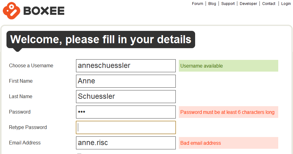
Helpful error messages, good choice of fields that can benefit from inline validation and a nice and clean design. I know exactly what I did wrong and what I need to do to make it right. I also get positive feedback for fields that might have issues (i.e. the username which may or may not be already taken) that I need to be aware about.
Before I go too deep into the details of inline validation, I’d like to point everyone to the article „Inline Validation in Web Forms“ by Luke Wroblewski at A List Apart which sums up a usability test with various forms of (inline) validation. While the article states that inline validation is generally a lot better than validating all input at once after the user has clicked Save (or completed a similar action), there are also some drawbacks and considerations when applying this design pattern. Basically, inline validation is good, but you still need to figure out how to use it for what you want to achieve.
Today I wanted to sign up for Club Nintendo, just to have a look. The first attempt failed because I tried to sign up on the US page and didn’t notice until far along the signup process that I was on the wrong page. However, I got a glimpse at how inline field validation is used here:
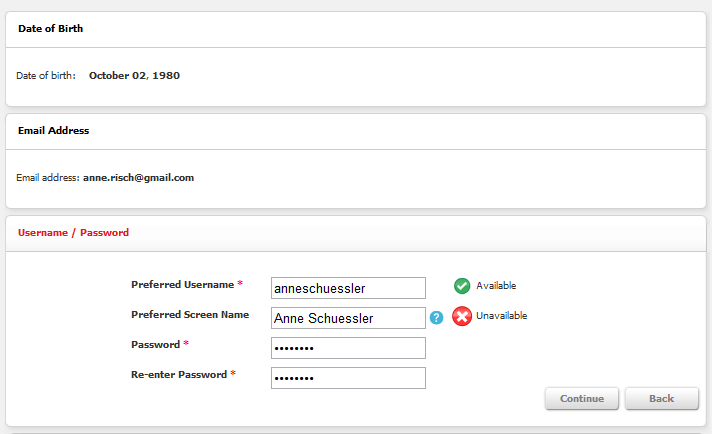
Apart from using a progressive disclosure pattern (which seemed a bit over the top here, but wasn’t actually disruptive) inline validation was nicely used for checking whether my chosen username and/or preferred screen name was still available.
The password fields didn’t use any inline validation, which makes you wonder a bit. Password fields are a brilliant candidate for inline validation, but apparently this wasn’t considered here.
However, when I switched to the European site, I got to use the following signup form:
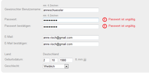
Never mind that it’s in German, I still think you get the point. I don’t care so much about how the US form used a step by step approach for filling out the form and this one just has everything on one form. Either way was fine by me.
However, although inline validation here was nicely used for the password fields, it was completely unhelpful. It told me that my password was invalid. But. It didn’t tell me why. Nowhere on the page could I find any information on how my password should look like to be accepted. This is definitely irritating and annoying. Applying inline validation and then refusing to give any reasons for wrong input seems like the UI design version of „It’s the thought that counts“. Unfortunately in this case, it’s not. If you want to do it right, do it right and don’t stop when your halfway there.
Inline validation is a great way to give immediate feedback on the user’s input and help them fill out a form correctly with the very first try. But it only works if you provide helpful and clear information as well.
PS: I finally figured out a password that worked. My guess is that Club Nintendo Europe doesn’t approve of any symbols in their users‘ passwords. Not sure who thought this would be a great idea. I don’t agree. And I also don’t know whether this actually was the reason.